Polovni Automobili
Redesigning popular used cars app for better usability and visual interface
Serbia’s #1 used-car marketplace, Polovni Automobili, had a mobile app that hadn’t evolved: overloaded listing cards buried the info people actually need, filters often led nowhere, and comparing cars felt painfully slow so most users quit before messaging a seller.
I proposed brand new experience simplifying the entire flow to match modern marketplace standards: cleaner, faster scanning, intuitive and forgiving filters, and contact options placed exactly where decisions happen.
User Research and Interviews
I spoke with 3 regular users of the app - not to ask what they wanted, but to watch how they actually use it. A pattern showed up fast: most weren't shopping to buy today. They were scanning dozens of listings daily, tracking prices, and spotting deals while treating the app as a market-watching habit, not a simple checkout.
Evidence from users
Early Exploration
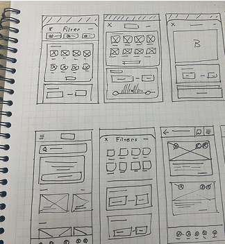
Which attributes matter before opening a listing?
How should filters reveal complexity progressively?
How can saved cars remain manageable over time?
Problems and Challenges
Users browse dozens of listings before contacting a seller - but cluttered cards, unreliable filters, and constant back-and-forth made that slow and frustrating.
Real problem ran even deeper: the app was built as a one-time purchase flow, while most people actually use it as a daily habit of checking prices, tracking deals, and comparing over weeks before ever contacting anyone.
Optimized for Browsing and Comparison
Final design improves the browsing experience by enabling faster scanning, easier comparison, and more efficient filtering. Key interactions are simplified to reduce friction and help users reach relevant listings quickly, while supporting both quick decisions and ongoing exploration.
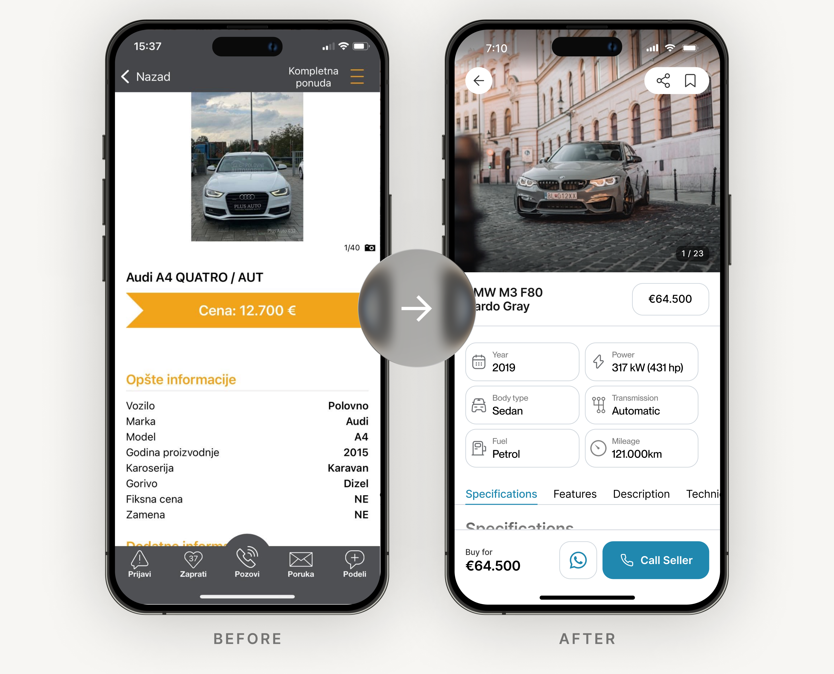
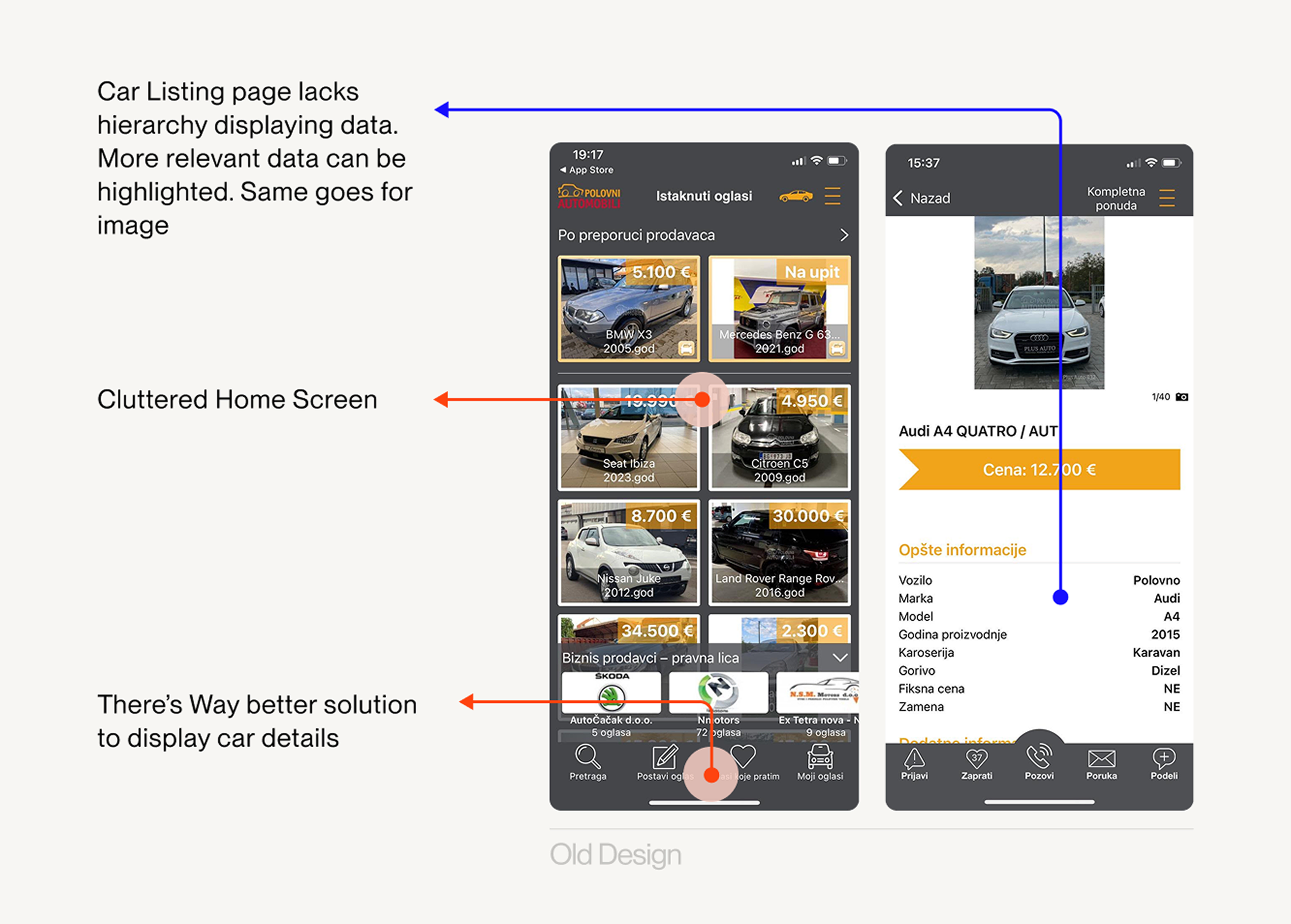
Before: cluttered, buried specs, painful to scan.
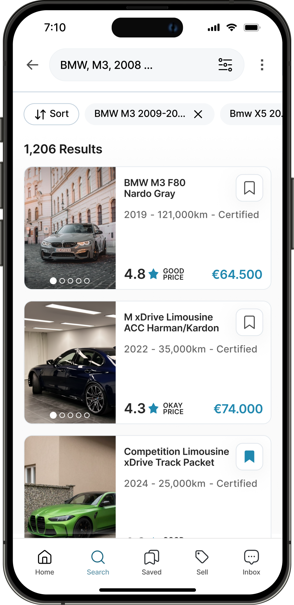
After: cleaner layout, essentials at a glance, no distractions expected to make browsing 2-3× faster and far less frustrating.
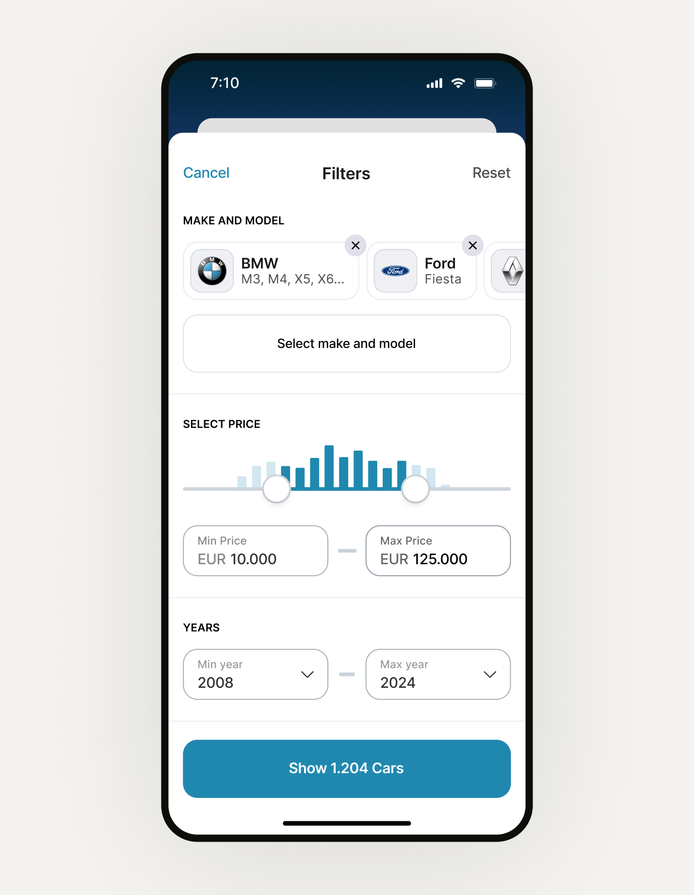
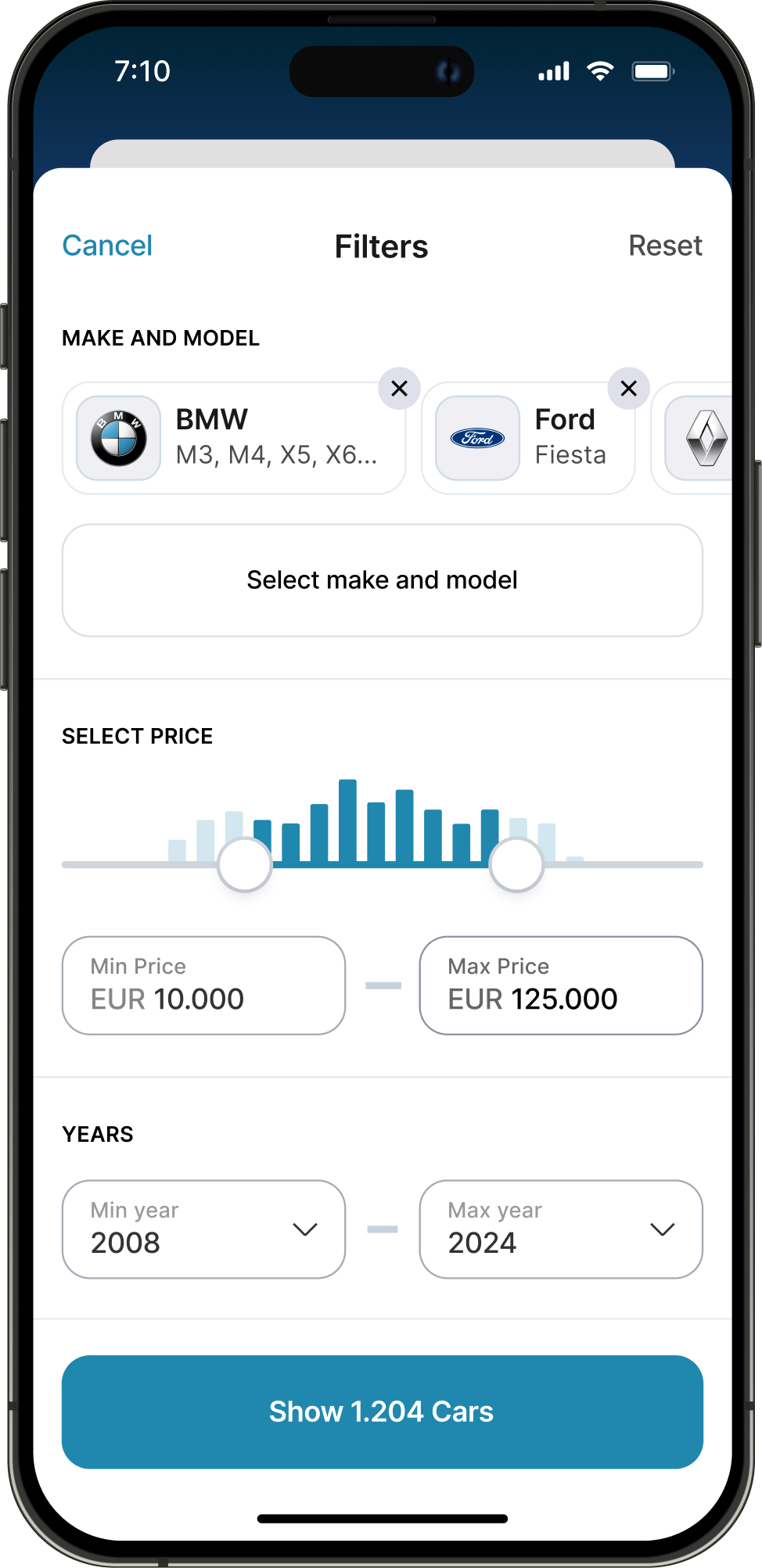
Reducing irrelevant results early - filters prioritize key constraints to narrow listings quickly and avoid zero or irrelevant results, keeping users engaged in the browsing flow.
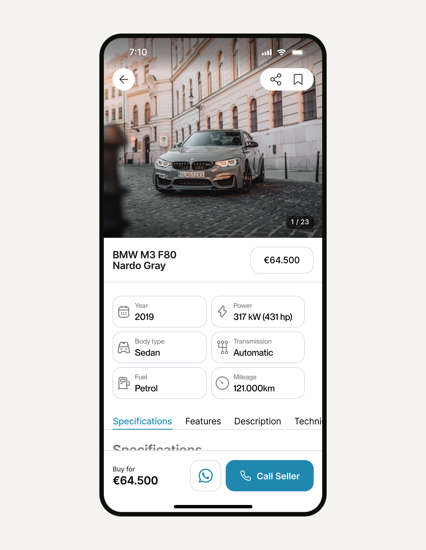
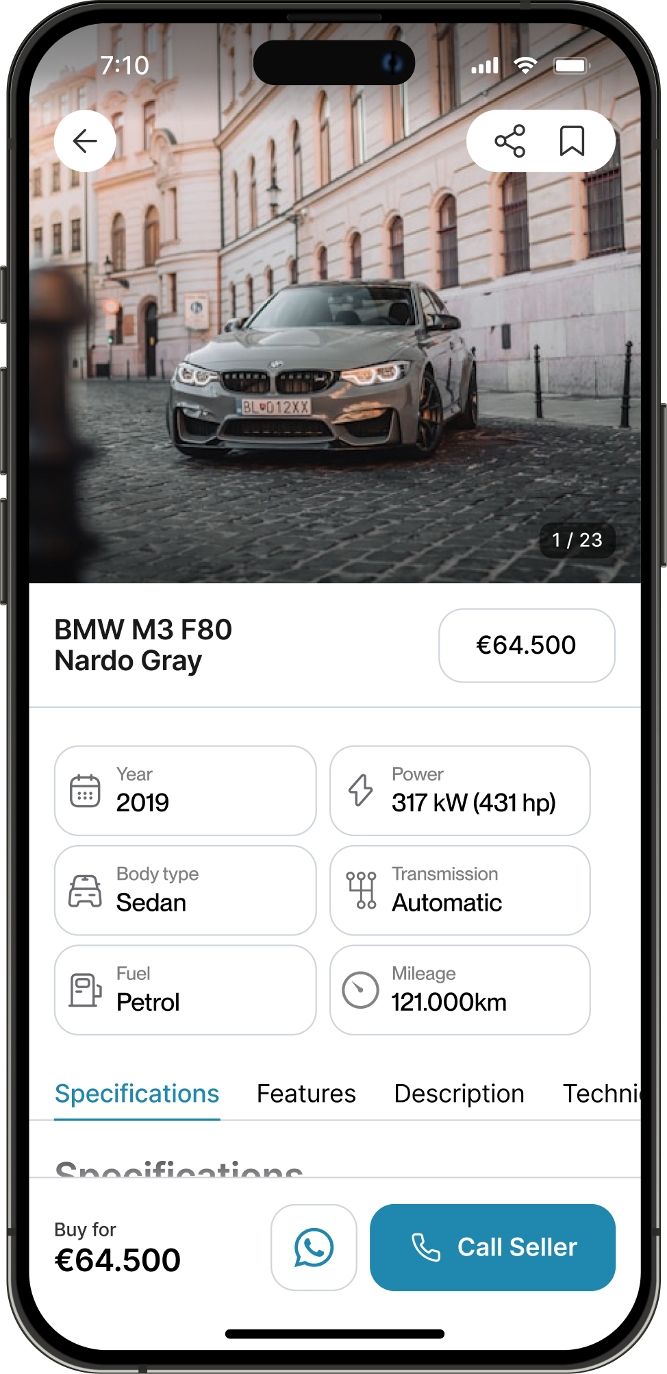
Supporting quick decisions - key specs and pricing are surfaced immediately so users can evaluate a listing within seconds, reducing friction and increasing the likelihood of contacting the seller.
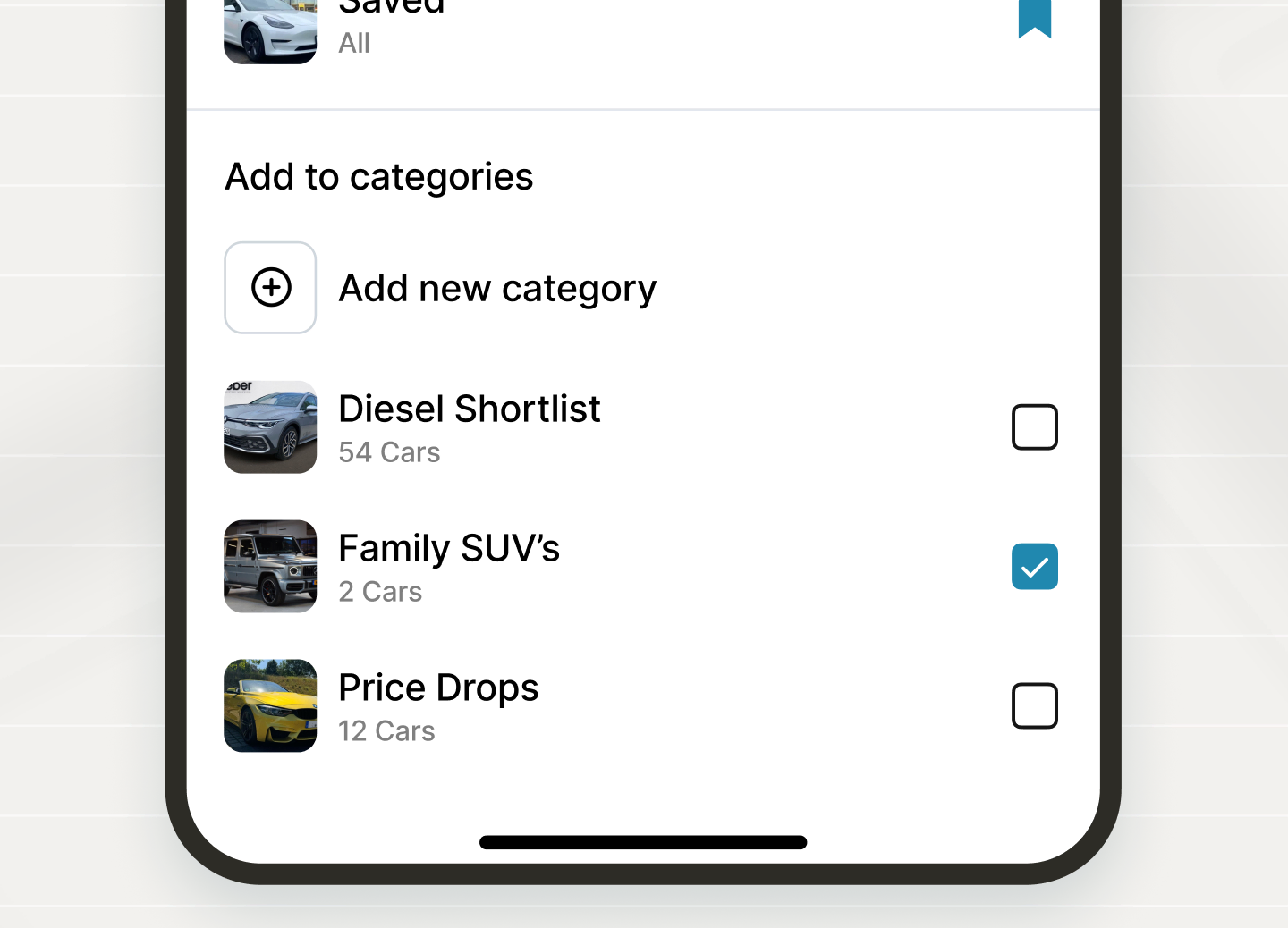
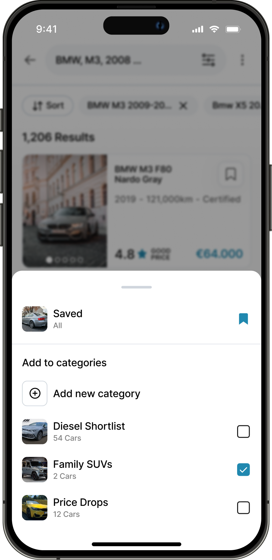
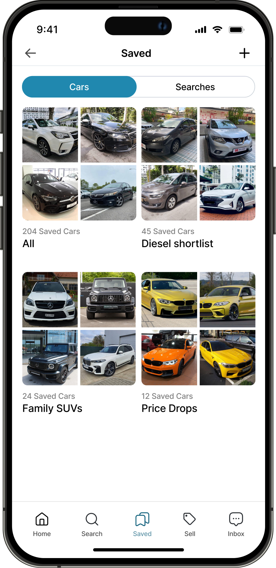
Improving retention - saved cars and searches allow users to continue their decision process over time without restarting, supporting repeat visits and ongoing comparison.
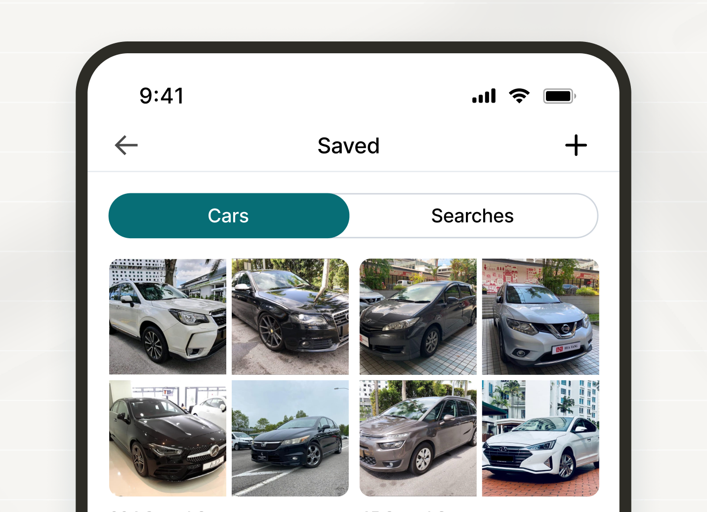
Organizing saved listings - categories help users manage large numbers of saved cars, making it easier to revisit and compare options over time.
Users rarely decide in a single session, making retention features critical in the marketplace flow.
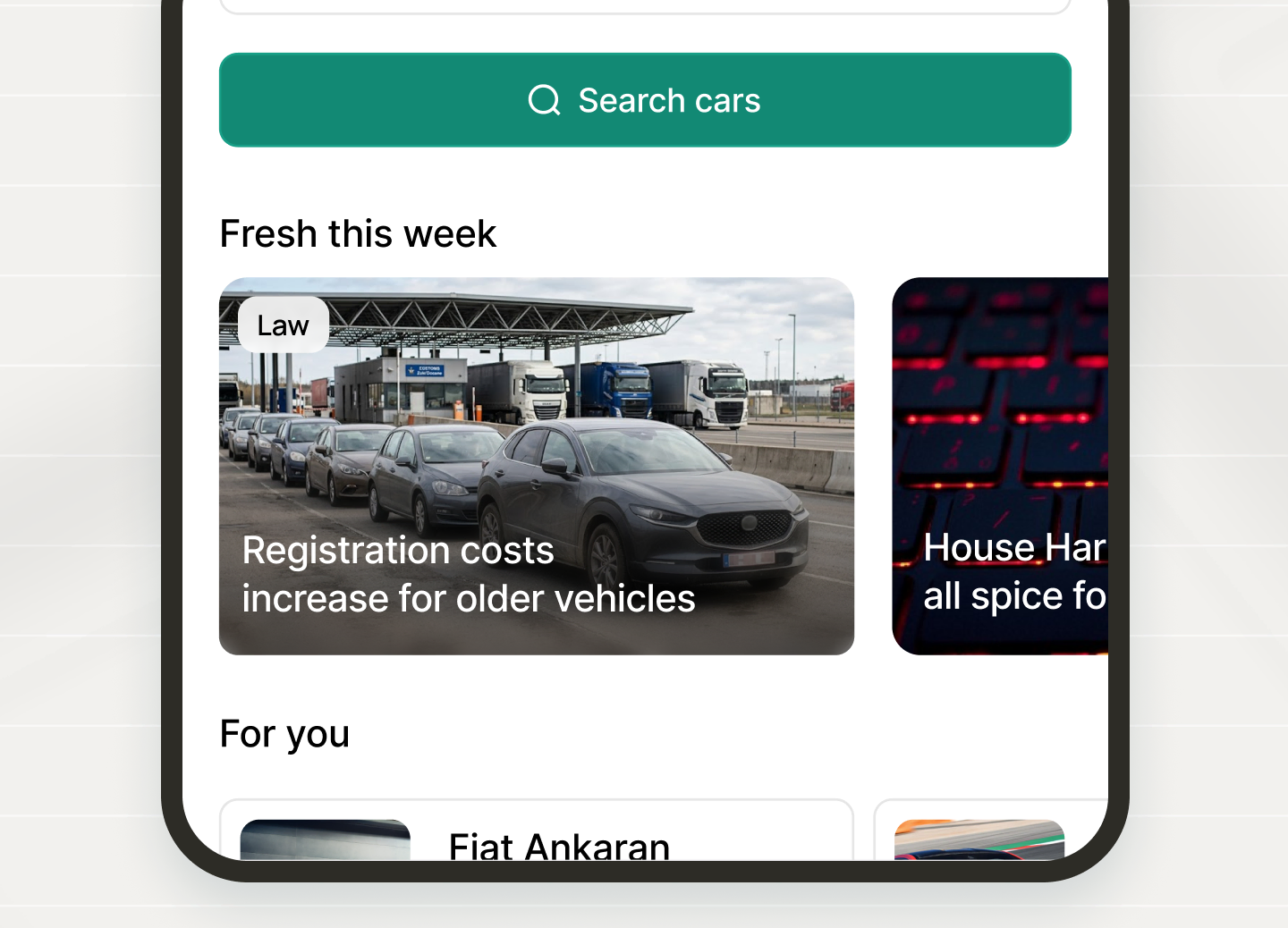
Driving daily engagement - car related news gives users a reason to return even when they are not actively searching for a vehicle. By surfacing relevant updates like regulations and market trends, the app becomes part of users daily routine, increasing session frequency and overall engagement.
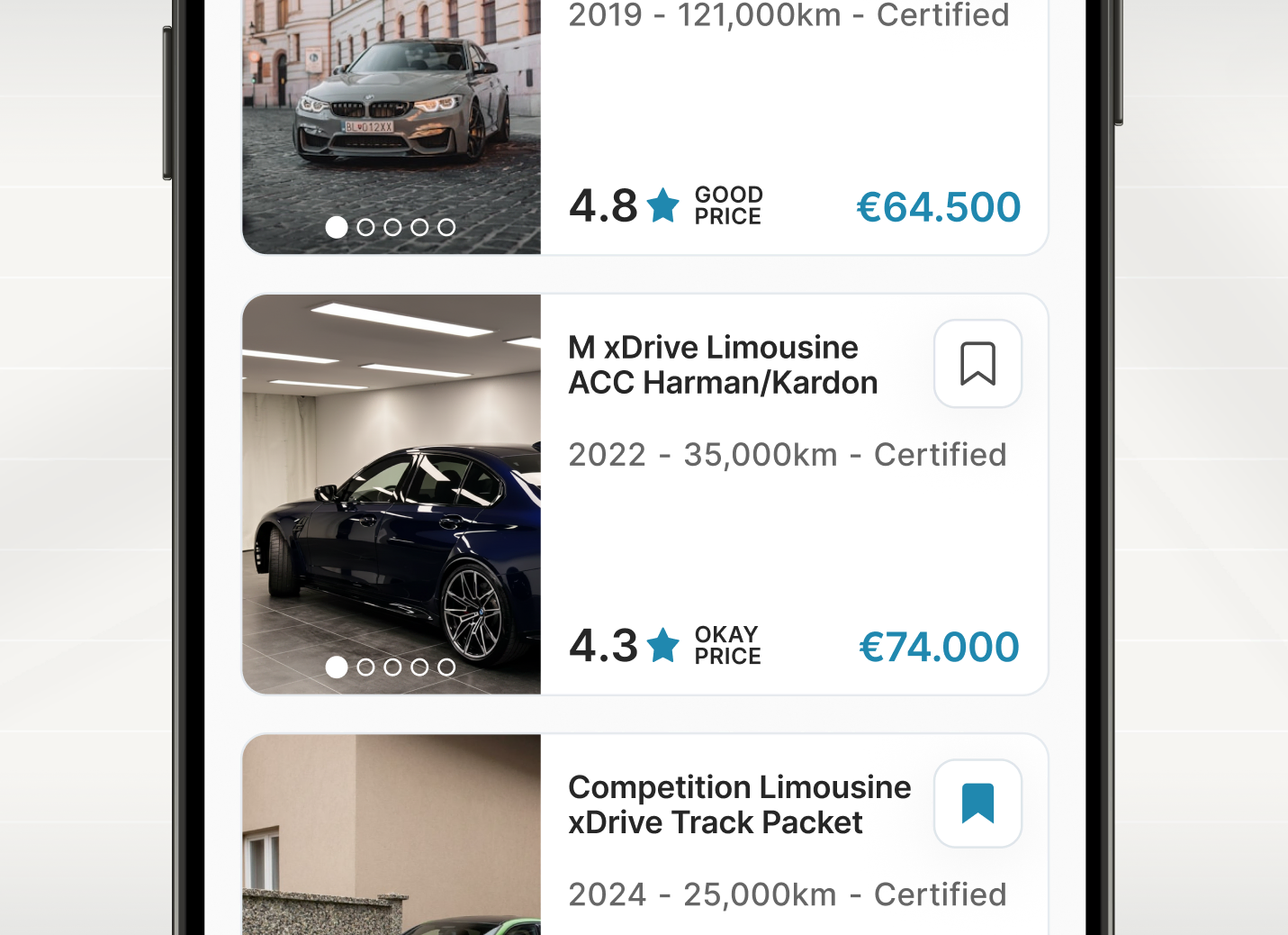
Optimizing for fast comparison - search results are structured to surface key information like price, mileage, and condition at a glance. This allows users to quickly scan and compare multiple listings without opening each one, reducing friction in the browsing stage and increasing overall listing engagement.
Final Thoughts
The redesign improves the core marketplace flow through faster filtering, easier comparison, and a clearer path to seller contact. The main challenge was balancing information density with clarity, giving users enough detail to compare cars quickly without overwhelming them.
Next, I would test listing card density, smarter filter defaults, the impact of saved features on return behavior, and whether car news increases engagement without distracting from the marketplace experience.