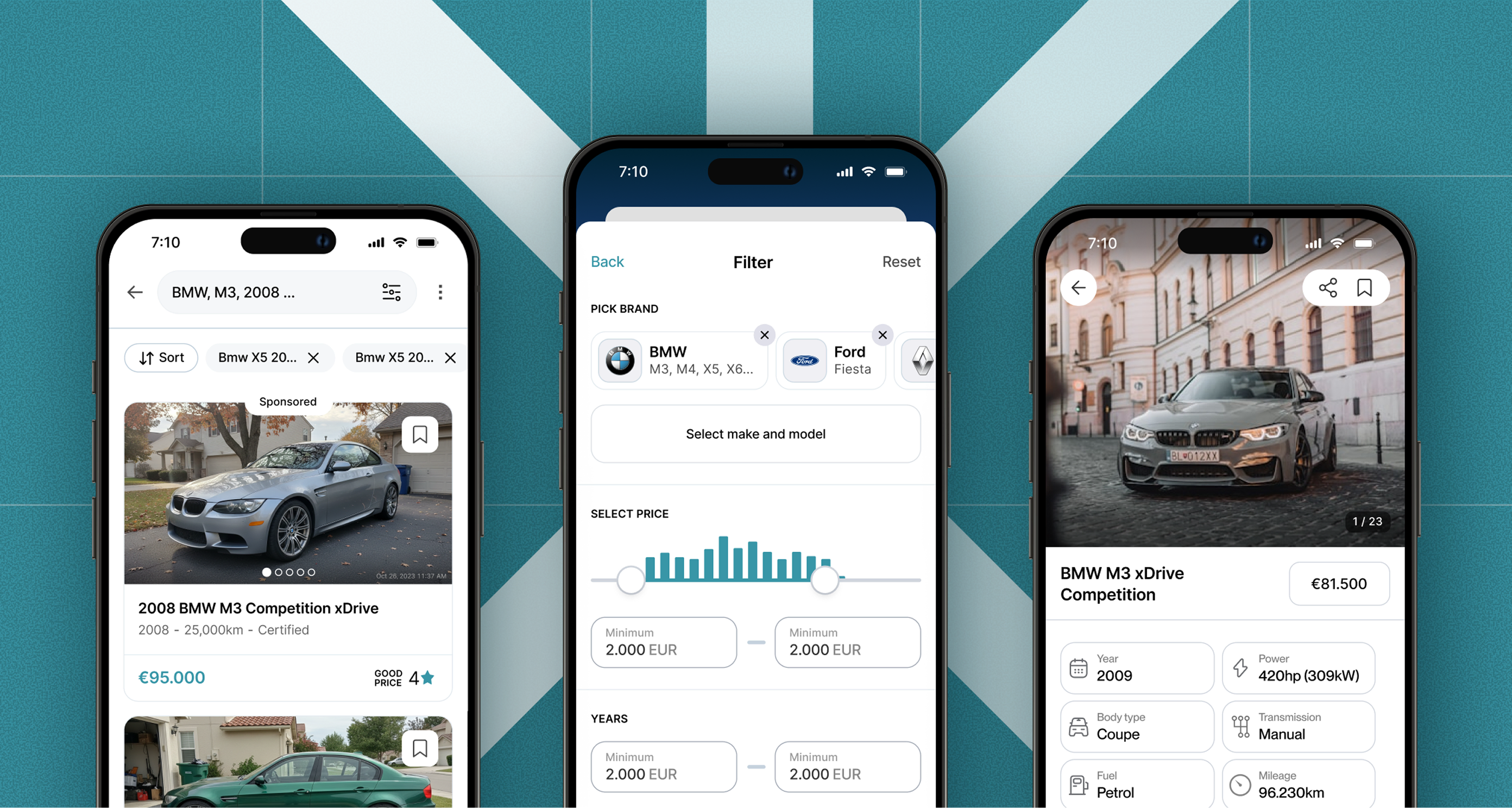
Mahone - Rental Marketplace
Faster rental discovery, from search to landlord contact.
Mahone is a conceptual rental marketplace designed for Belgrade, Serbia’s largest rental market. While searching for a home myself, I found that dominant platforms made discovery harder than necessary through dense filters, messy listing pages and weak map integration.
I designed Mahone around one goal: reduce the effort between starting a search and contacting a landlord. The experience prioritizes fast filtering, easier comparison and stronger confidence in each listing.
Research & Diagnosis
To understand where rental discovery breaks down, I combined my own experience searching for an apartment in Belgrade with an analysis of dominant local platforms and stronger international marketplaces. I compared how they handled search, filtering, map browsing, listing cards, property details and landlord contact.
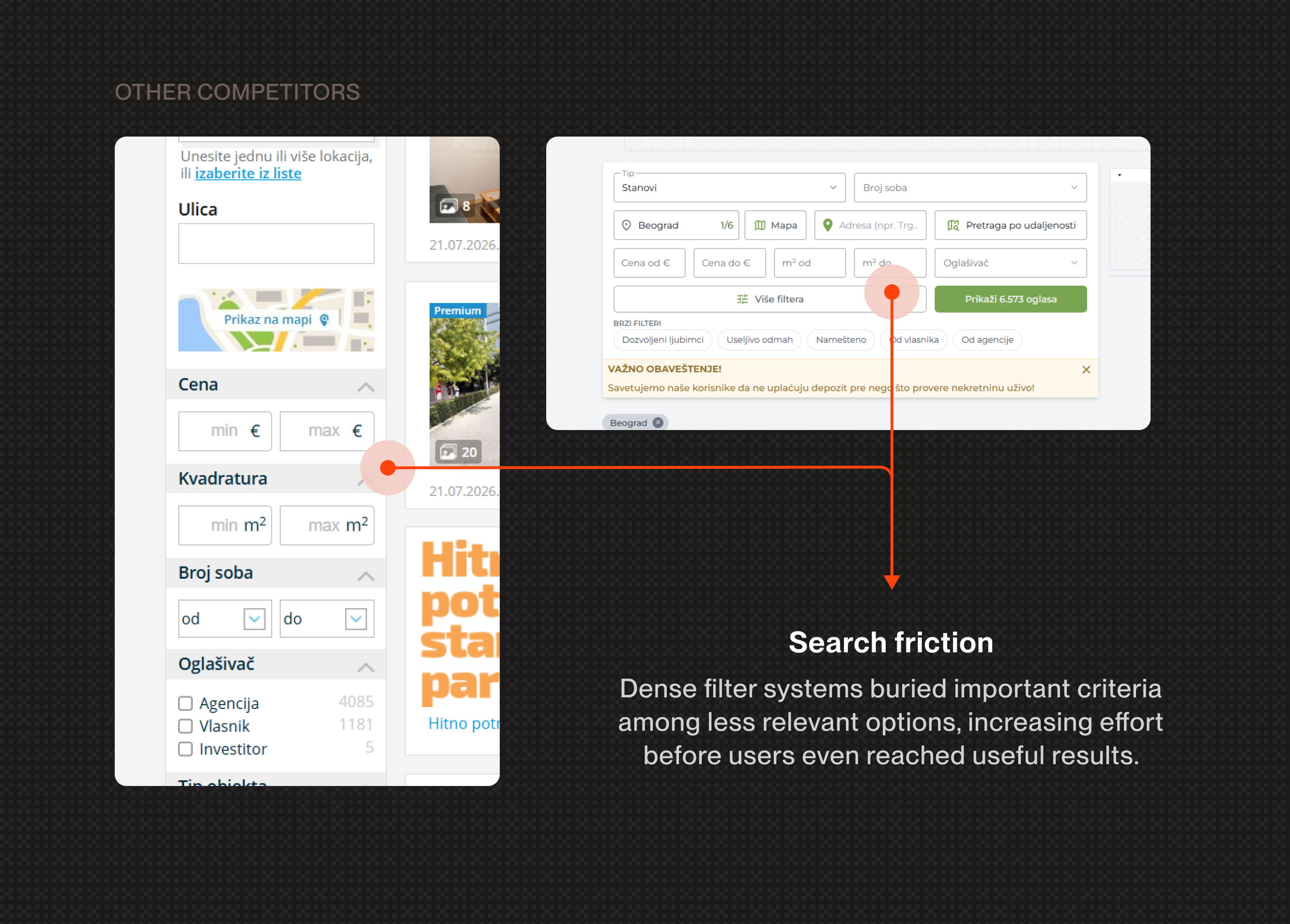
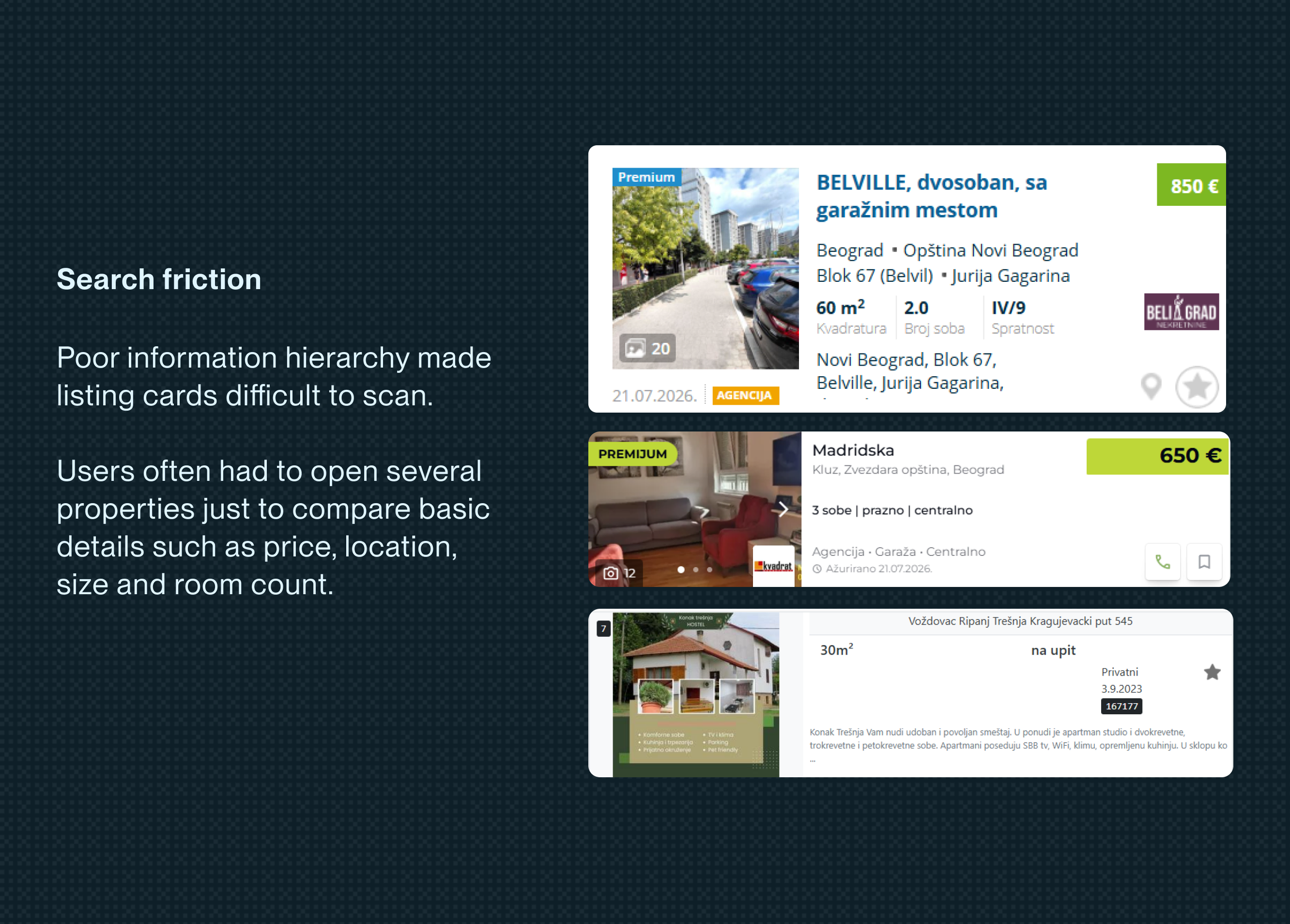
The core problem was not lack of inventory, but the effort required to narrow options, compare properties and trust what was being shown.
Product Strategy
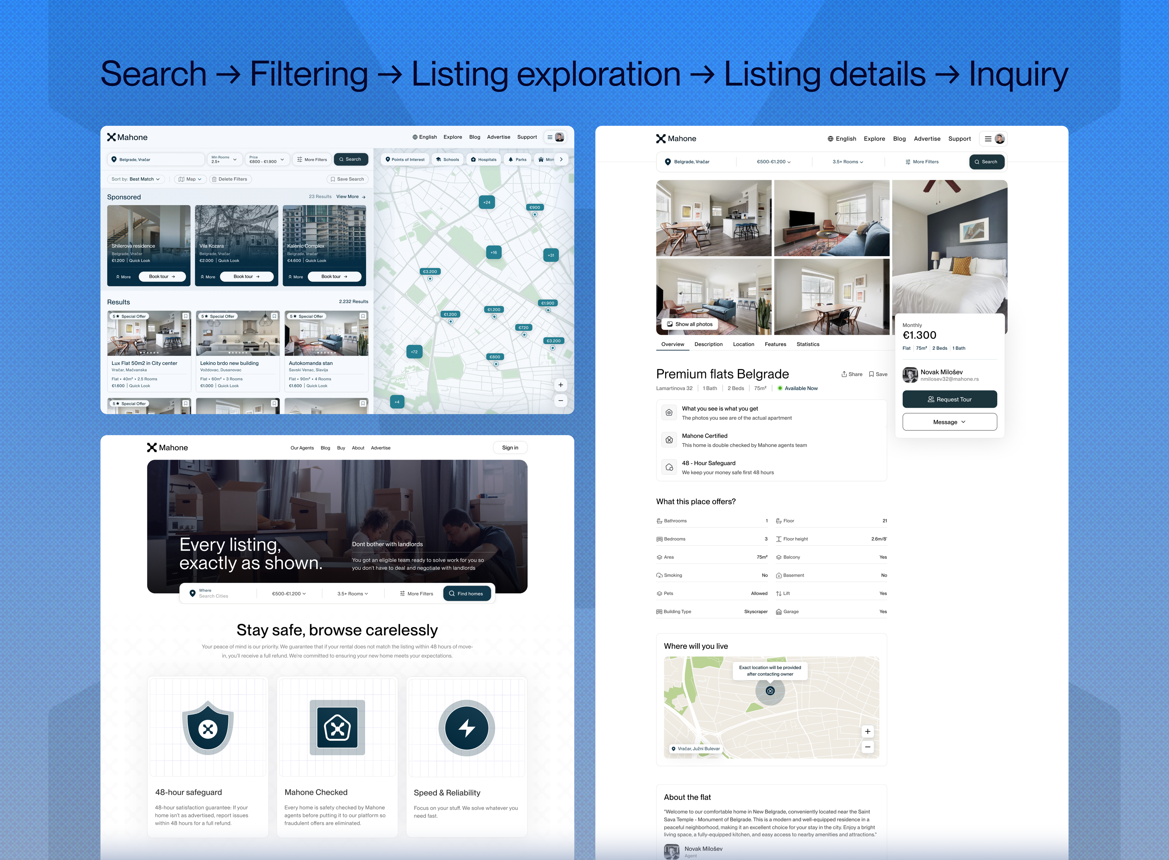
In a market where ad can sound like “LUX APARTMENT DOWNTOWN AFFORDABLE” can be five kilometers away, the first question is not “How much?” but “Is this real?” Verification and consumer-protection signals appear before the main pricing and contact decisions, answering that question early.
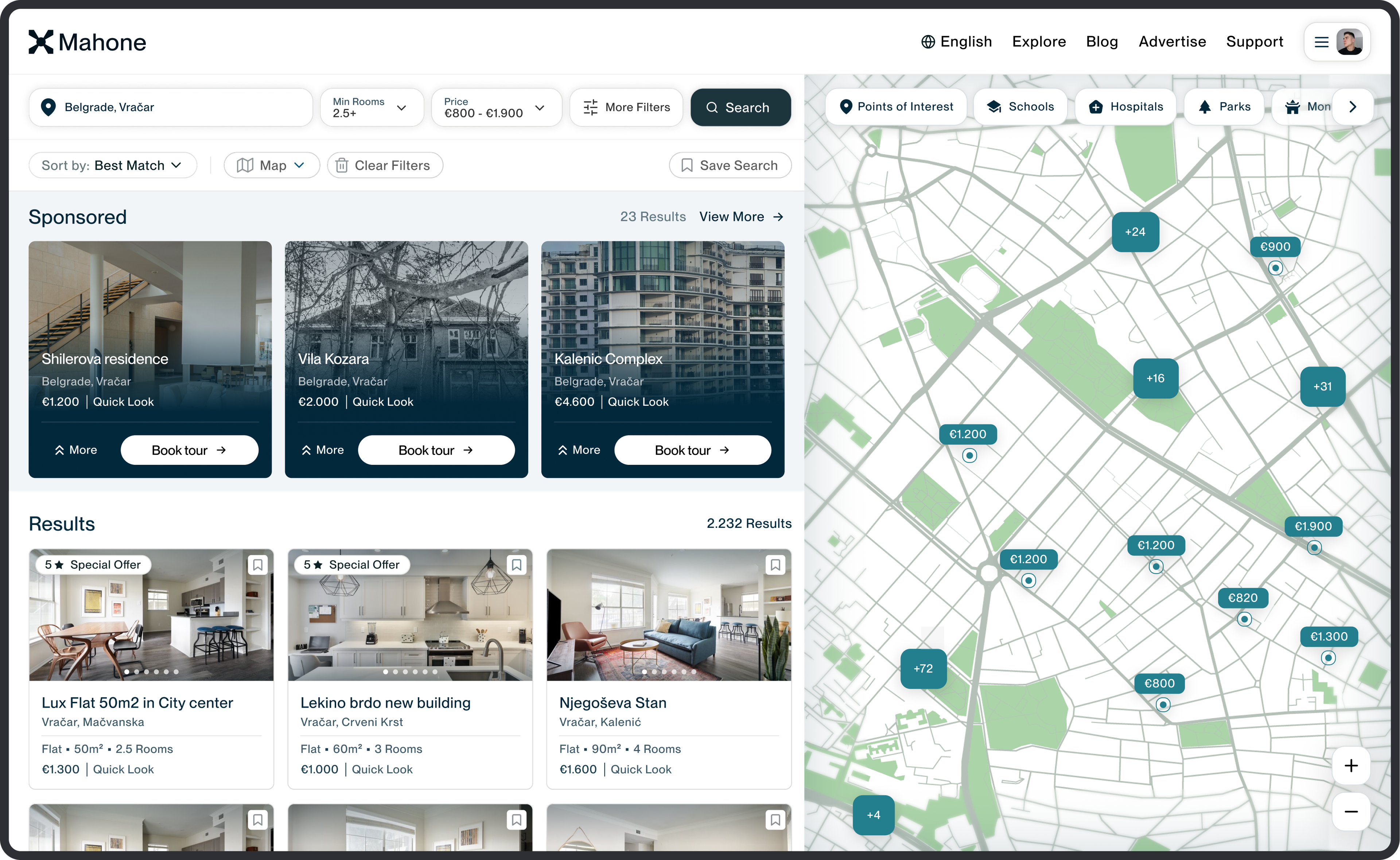
The listing page prioritizes the information renters need to judge a property quickly - photos, price, key attributes and landlord contact - before exposing secondary details further down the page.
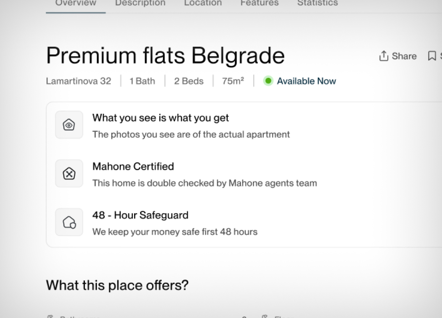
Key attributes are grouped and structured for quick scanning instead of being buried in long descriptions.
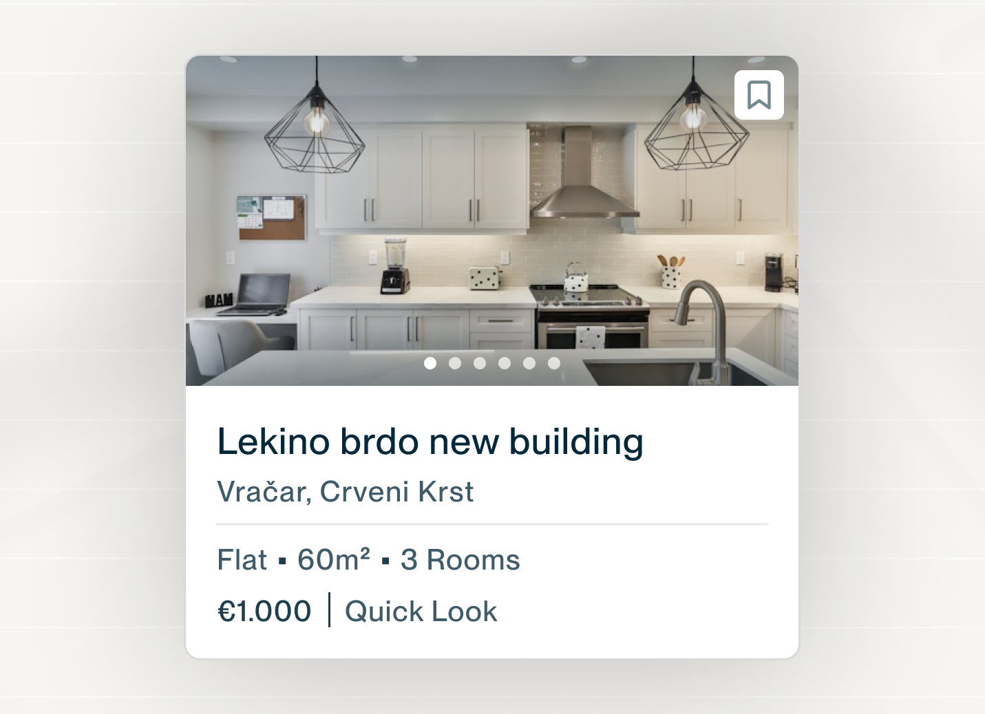
Location information stays directly within the property page, helping users evaluate the area without breaking their flow.
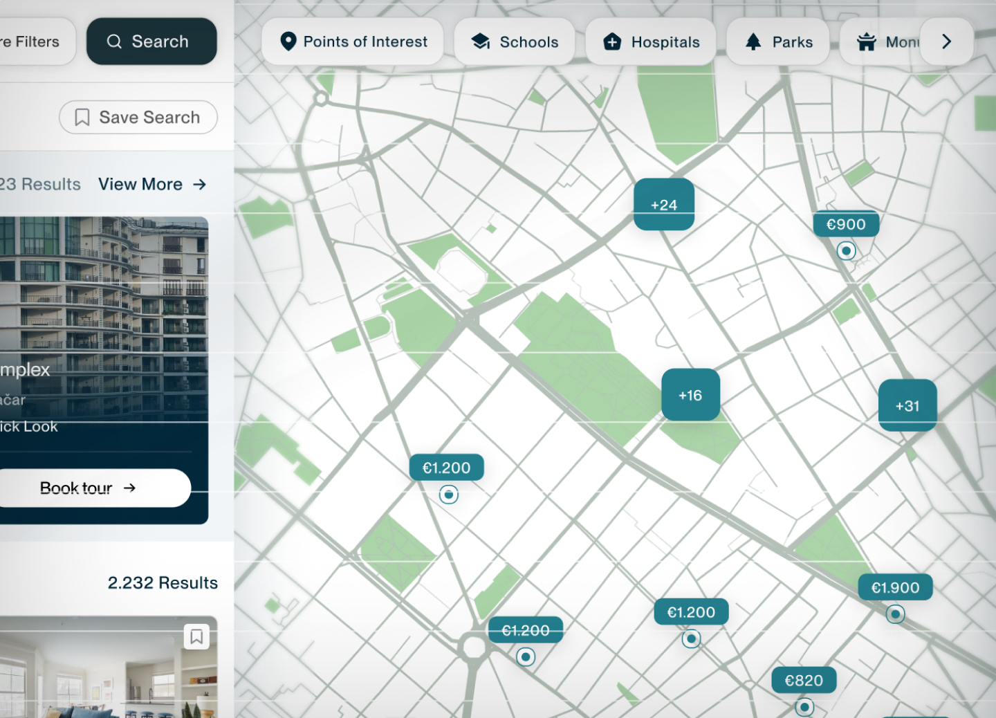
The map remains a primary browsing tool, allowing renters to understand location and compare nearby listings visually.
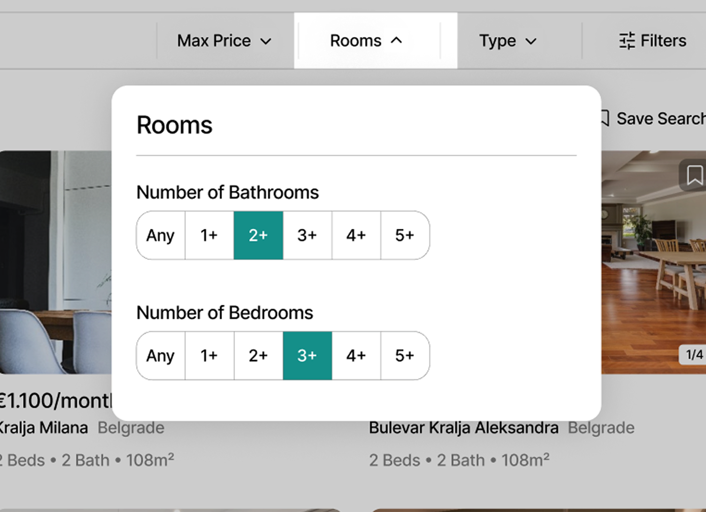
Common filters stay immediately accessible, while more specific criteria remain available without overwhelming the initial search experience.
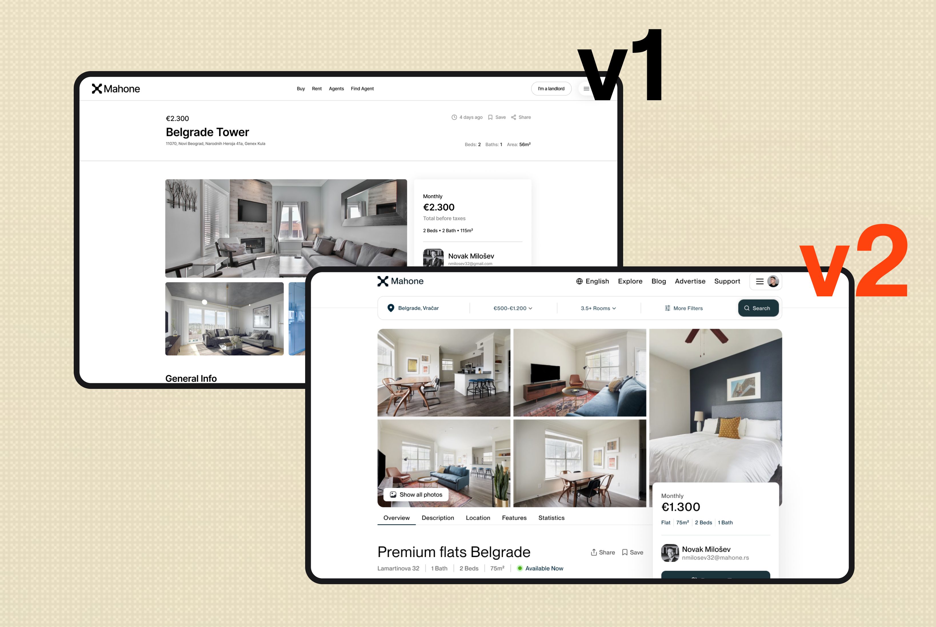
The second iteration reduced visual noise, improved information hierarchy and brought the primary decision-making content higher on the page.
What I Would Validate Next
If Mahone launched, the number I'd care about is search → inquiry - of the people who run a search, how many actually contact a landlord? Everything else is a bet that this number is low because renters don't trust what they're seeing.
If search → inquiry doesn't move, the trust thesis is dead and the real bottleneck is something else - probably price. Belgrade rents outran salaries; maybe people don't hesitate because they distrust the listing, they hesitate because they can't afford it. No interface fixes that. I'd want to find out before building any of this.